How to Choose Wall Panel Color and Finish (2026)
How to choose wall panel color and finish: read the light first, match the undertone, pick the sheen, then test the sample on your own wall.
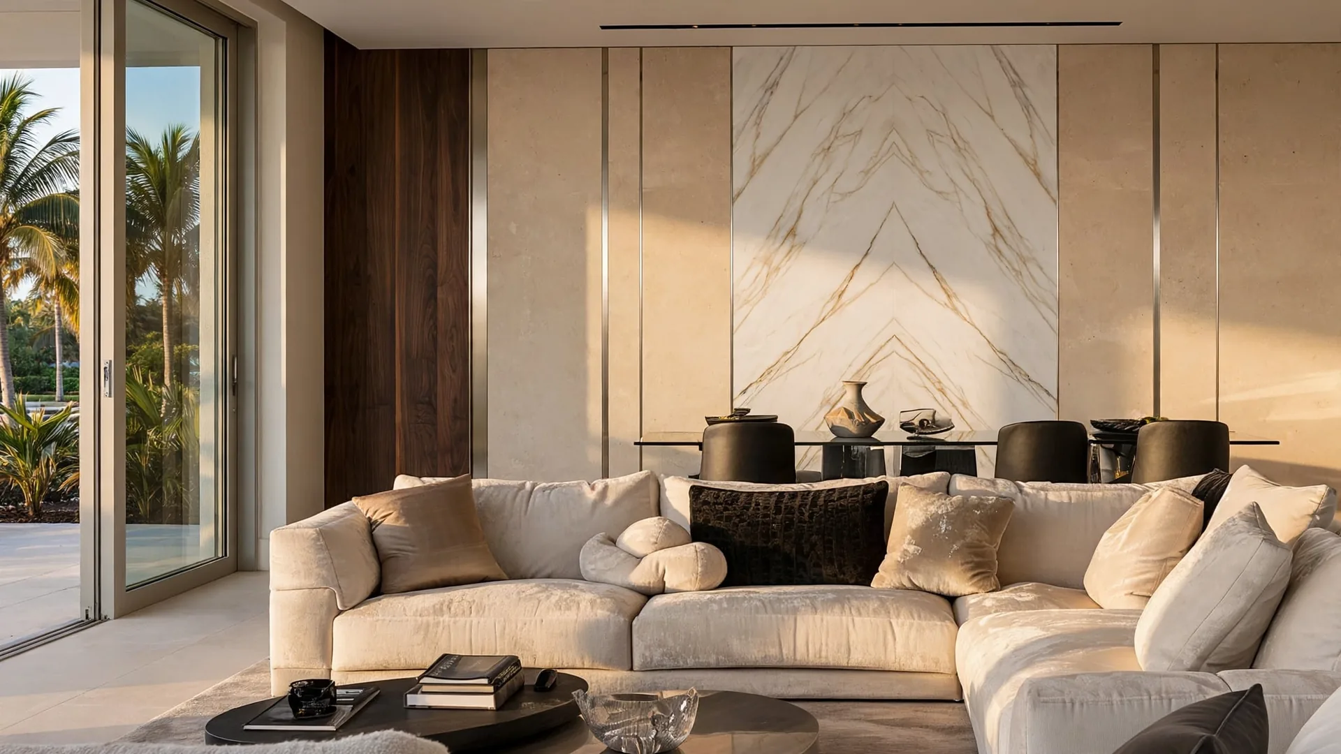
Every client I meet has the same photograph on their phone: a beautiful wall, in somebody else's room, in somebody else's light. Then we stand in their living room at four in the afternoon, Florida sun coming sideways through the sliding glass doors, and the color in that photograph is simply not available here. It never was. Color is not a property of a panel. It is what your room's light does to a panel, hour by hour.
I install large-format panel walls (single sheets that run floor to ceiling, 48 by 108 inches) across South Florida, and color choice is where projects are won or lost long before anyone cuts a sheet. So here is the method I actually use: read the light first, settle the undertone (the warm or cool lean underneath a surface color), pick the sheen (sheen means how much the surface reflects – flat at one end, glossy at the other), and understand how your finish family holds color. Only then fall in love with a name like Calacatta or walnut.
The short answer first
TL;DR: Choose in this order: (1) how light or dark the wall should read in your room's own light, (2) a warm or cool undertone that agrees with your floor and furniture, (3) the sheen – matte or satin for most living walls, gloss only in small doses, (4) the finish family, and (5) the exact color, tested as a sample on your wall through a full day. Reverse that order and the showroom picks your color for you.
That order feels backwards to most people, because the color name is the fun part. But a name travels badly. The five sections below are the order I work in, and each one can veto the section after it.
Start with light: how bright the color reads
TL;DR: Paint makers measure brightness as LRV – Light Reflectance Value, a 0 to 100 scale where 0 is black and 100 is pure white. Panel finishes rarely publish an LRV, so I never quote one for a sheet. I use the scale as a thinking tool: decide whether your wall should read light (roughly the top third of the scale), mid or dark, in your brightest hour, and hold every candidate to that decision.
HunterLab, a color-measurement company, gives the working bands most designers use: below 20 reads dark, 20 to 50 midrange, 50 to 80 light, above 80 white. Homes & Gardens makes the point I repeat to clients: a higher LRV helps brighten a room, but light has to be present for a surface to reflect it. A pale panel in a dark hallway is a gray panel.
This is why I judge samples at the brightest hour of the day, when the light is at its least flattering. In a bright South Florida living room, most painted walls around my panel fields (a field is the main large area of one finish) sit in the light band, and a very pale panel under hard direct sun can read chalky and washed out. In a shaded room the same pale finish reads calm and expensive. Neither reaction is in the sample. Both are in the room.
One more light source matters after sunset: your bulbs. Warm light in the 2700 to 3000K family (the K is kelvin, the scale for light color) flatters travertine warmth, walnut grain, leather and brass in the evening, while a cool 4000K fitting over the same finishes grays the veining (the thin colored lines running through a marble look) and flattens velvet. Our living room panel guide walks through that room's light in full. Choose the color under the light you will actually live with at 8 p.m., because that is when you will see the wall most.
Undertone and the direction your windows face
TL;DR: Every neutral carries an undertone – the warm (yellow, beige, gold) or cool (blue, gray, green) lean underneath the surface color. North-facing rooms get cooler, bluer light, so warm undertones keep them from going cold. South-facing Florida rooms get strong warm sun all day, so cooler undertones calm a color down. Match the undertone to your floor and fixed furniture before you match anything else.
The room's orientation does half this work for you. Neptune, the interiors company, gives the classic guidance: north rooms receive less and cooler light, and yellow-based warm neutrals bounce what light there is around the room. A South Florida painting contractor, Tru Colors Contracting, says the local version out loud: south-facing rooms here are flooded with sunlight all day, colors appear warmer and more vibrant, and an already warm shade can feel too intense by mid-afternoon.
Undertone fights are the failures I get called to fix. A cool gray-veined marble look beside a warm honey floor reads blue and cold, and the homeowner blames the panel. A warm gold-veined finish beside cool gray cabinetry reads orange, and the homeowner blames the light. Nobody changed the panel or the bulb – the undertones were never introduced to each other. Hold the sample flat against the floor, then against the biggest piece of furniture that is staying. If the sample looks good in both places, you have a candidate. If it only looks good alone, you have a photograph.
The same warm-cool split shapes pairings inside the wall itself. Warm travertine sits naturally beside walnut veneer (a thin layer of real wood bonded to a stable core) and brass. Cool gray marble looks sit naturally beside pale oak and chrome-toned metal. Crossing families works when you do it on purpose. A cool stone field can cool down a very warm room. It fails when it happens by accident at the sample table.
Sheen: matte, satin or gloss
TL;DR: Matte hides the wall's imperfections and kills glare; satin is the safe middle that reads like honed stone (honed means a matte, unpolished finish); gloss reflects the room back at you, shows every flaw, and mirrors windows and screens. For a main living wall or a TV wall I steer clients to matte or satin almost every time.
Sherwin-Williams' gloss guide puts numbers under the words: sheen is measured from 0 (no reflection) to 100 (mirror-like), flat and matte sit at the bottom, satin in the low-to-middle band, gloss at the top. The same guide warns that glossy finishes can look mottled (blotchy and uneven) on a rough or uneven surface. Paint-world guidance agrees on the trade-off: matte hides patches and unevenness best and washes hardest, gloss washes easiest and shows everything.
Panels follow the same physics, with one addition: a printed or coated finish has a fixed sheen you cannot repaint later, so the choice sticks in a way paint does not. Our panels versus paint comparison covers that lock-in honestly.
Room by room, my advice stays the same. Behind a TV, matte or low sheen. Home Theater Academy and AudioChamps, two home-theater sources, both recommend matte around a screen because bright reflective surfaces bounce glare across the viewing area, and a polished marble look is the one finish I steer away from the wall directly behind a screen in a bright room. On a travertine look, I insist on matte: a glossy travertine print contradicts the stone it imitates, and gloss is where printed finishes usually give themselves away. On marble look, I choose satin, which diffuses reflections and reads like honed stone. Gloss earns its place in small, deliberate doses – a powder room wall, a backlit niche – where the reflection is the point. Our marble-look guide and our travertine guide each defend their sheen in detail.
The finish families, and how each one holds color
TL;DR: A color behaves differently in each finish family. Marble-look color lives in the veining, travertine-look stays in a warm matte band, real wood veneer shifts with cut and light, leather and velvet change shade with direction and age, and metal is an accent that borrows the room's light. Choose the family for its color behavior, then the exact shade.
| Finish family | Where the color lives | What changes it | My starting pick |
|---|---|---|---|
| Marble look | Veining (the thin colored lines running through a marble look) on a white or dark ground (the background color the veining sits on) | Vein contrast; warm light warms gold veins | Soft gray veining for calm rooms, gold veining for warm ones |
| Travertine look | A warm band: ivory, cream, tan | Texture and raking light (light skimming low across the surface); stays matte | The easiest full-wall color I install |
| Wood veneer | Real wood grain and cut | Cut (cathedral vs straight), sun, leaf sequence (a leaf is one thin slice of veneer) | Quarter-sliced (straight, calm grain) walnut or pale oak |
| Leather | The hide's (the animal skin's) dye and patina (the richer tone leather takes on with age) over time | Sun fades it; wear deepens it | Cognac or espresso on the quiet wall |
| Velvet | The pile (short upright fibers) direction | Brushing direction shades it a tone deeper or lighter | Deep green or navy with a stone return (the finish wrapping onto the side wall) |
| Metal inlay (a thin metal strip set into the surface) | Borrowed light, brushed or polished | Room light color; accent strip only | One slim champagne or brass line |
Marble look. The ground color is the easy half; the veining is the color decision. The Calacatta family I decode in the marble guide runs from safe to bold on one ladder: soft gray veining on white (the Carrara-style read, least likely to fight your furniture), gold and honey veining (warmer, richer), gray cobweb veining (the cool, moody one), and deep burgundy-wine veining (a statement, light enough to live with). Heavy black-on-white veining chosen for a luxurious effect often produces a cold room instead. Colored marble looks work best as one accent wall in an otherwise quiet room.
Travertine look. Its colors stay in a warm band – white, tan and cream at the center, gray and rusty tones at the edges – and the matte texture hides dust and fingerprints better than a polished read. In my experience, warm matte travertine is the easiest of the stone-look finishes to live with at full-wall scale. If a client cannot decide, this is where I start the conversation, and the travertine guide explains why.
Wood veneer. Veneer is real wood, 0.5 to 1.5 mm of it over a stable core, and it holds two color traps. First, the cut changes the color's behavior before the shade does: a cathedral-cut walnut (bold arching grain) draws the eye for years, while a quarter-sliced field of the same walnut sits calmly. I tell clients to choose the cut before the exact color. Color can shift a shade with finish and light; the figure is structural. Second, book-matched leaves (two matching slices opened side by side like a book, so the grain mirrors) can show a barber-pole effect, where flipped leaves reflect light differently and one leaf reads slightly darker than its mirror twin. See it on a sample pair before you commit. Our veneer guide has the cut table.
Leather and velvet. With soft finishes, name the material before you discuss its color: a real hide or fabric surface, or a soft look printed and textured onto a hard, wipeable sheet. The color behavior is different. Real leather develops a patina (the richer tone leather takes on with age); velvet shades itself – brush the pile one way and it catches light, brush it back and the same panel reads a shade deeper, so every panel in a field gets its pile running the same direction. Our leather and velvet guide sorts the four leather types before color, which is the right order.
Metal. Brushed champagne and antique brass read warm; chrome-toned and smoked mirror reads cool. A metal inlay works as a line across the wall. It borrows the light and ties two finishes together. Keep it to one line and let the fields do the talking.
Small rooms, dark colors and other honest effects
TL;DR: Light colors do make a room feel larger – that one is experimentally supported. A dark panel wall makes a deliberate, cocooning room and a smaller-feeling one; both are true, so choose on purpose. Large-format sheets help a small room because fewer seams mean fewer visual interruptions. Treat any claim that a color adds a specific number of feet as marketing.
The best-tested claim in this whole article is the simple one. In a 2018 PLOS ONE study using full-scale simulated rooms, von Castell, Hecht and Oberfeld found that the brightness of the bounding surfaces significantly changed how large the room felt – lighter walls read farther away, and bright ceilings read higher, whatever the color. So for a small living room or a tight primary bedroom, a light travertine or pale marble look has real evidence behind it. No other color effect in this article can claim that.
Dark colors are not banned by that study. A low-brightness wall absorbs light and reads closer, which is exactly the cocooning effect a media room or a moody bedroom may want. The mistake is choosing dark for a small room while expecting it to feel bigger. It will not, and no finish changes that.
Panel direction gets more credit than the evidence gives it. The same research group found in later experiments that pattern density mattered more than whether a pattern ran vertically or horizontally. Fluted (with narrow vertical grooves) or veined direction can still guide the eye. I run travertine veining horizontally to widen a wall visually, and vertically to add height. I present that as a composition choice. A physics claim would need a measured number, and nobody has one.
What actually helps a small room, on the panel side, is the format itself. Our sheets are 48 by 108 inches, so a small wall takes one or two sheets with minimal seams. Tile and panel makers from American Olean to RD Marble make the same point about large formats: fewer joints, a surface that reads as one piece, and a room that feels calmer and more open. In a small room, spend on the large sheet and a light color before you spend on a bolder pattern.
Florida sun: the color you keep is the color that survives
TL;DR: Sunlight is what changes panel colors here. Time alone, in a shaded room, barely touches them. Ultraviolet light accounts for roughly 40 percent of interior fading, with visible light and solar heat at about 25 percent each, per Avery Dennison's window-film research. Veneer, leather and velvet change first in a hard sun patch; I place those finishes on the walls the sun reaches last, and I photograph the sun patch before the layout is final.
Florida gives a panel wall two climates: the air-conditioned one you control, and the sun patch you do not. Any wall that takes direct afternoon sun through sliding glass doors will age its finish unevenly – one sheet in the patch, one sheet out of it, and the difference shows at the seam. My working method is dull and effective: before the layout is final, photograph the sun patch on the target wall at late morning, mid-afternoon and early evening. The patch tells you where a rich walnut, a deep velvet color or a dark leather can live, and where a light stone look should go instead. A light stone look sits happily in a hard sun patch for years; the deep finishes change first.
Veneer deserves its own sentence because it is real wood. Direct sun lightens or darkens wood depending on the species, and my standing advice is blinds, sheers or a UV-filtering window film on the glass that hits the wall – the layout conversation belongs before installation, while the field can still move to a calmer wall. Our care guide covers what sun does after the install, including the point that no cleaning routine fixes a fade.
What I will not do is promise you a fade-proof color. No finish I install carries a published fade rating I can quote you, and the honest sentence is this: manage the sun, place the deep colors out of its path, and the wall keeps its color. Ignore the sun, and the sun edits your palette for you.
Combining finishes without a fight
TL;DR: My studio rule is a maximum of two or three main materials in one composition, with a thin metal insert and LED light counting as accents rather than materials. Only one of the main materials should be soft. And the default is one wall – a strong finish carried around all four walls stops reading as a home.
Combinations fail on undertone and on count, in that order. The pairings I return to most often: deep green or navy velvet as the main field with a travertine-look return on the side wall; cognac leather as a headboard field with pale veneer on the returns; travertine with one thin brass line as an accent. Each pairing crosses one boundary and stops there: hard against soft, warm against cool, matte against a single metal line.
Two soft fields side by side is the pairing I talk clients out of. Velvet next to leather gives you two matte, light-absorbing surfaces with no contrast in how they behave, and the wall reads heavy. Velvet against travertine, or leather against book-matched veneer, gives you the contrast that makes each material legible.
Scale is the other half of the rule. One wall, chosen well, is the whole game: four walls of a strong stone finish in a normal-size living room stop reading as a home and start reading as a lobby. If you want the bold color, give it the one wall the room already looks at – behind the bed, behind the sofa, behind the screen – and let the other walls stay quiet.
Test the sample like the wall depends on it
TL;DR: Never approve a color from a photo, a screen or one small sample under showroom light. Put the sample on the actual wall, in the actual room, and check it in the morning, at midday, in the evening and under your own bulbs, standing at viewing distance, beside your floor and your furniture. If a sample fails two of the tests below, walk away.
These are the tests I use across the finish guides, gathered in one place:
- The light test. Take the sample to a window, tilt it against the light, then check it under a warm indoor lamp. C2 Paint's sample guidance for homeowners says the same: view samples in morning, midday and evening light and under your artificial light, because hidden undertones appear as the light changes.
- The distance test. Step back 10 to 12 feet – the distance you will actually see the wall from. Veining that sings at arm's length can shout across a room.
- The neighbor test. Hold the sample against the floor, the sofa fabric and any cabinetry that is staying. Samplize, a paint-sample company, adds a useful warning that transfers directly: surface texture changes how a color reads, so judge the real finish surface, never a printed picture of it.
- The sun test. Leave the sample where the afternoon patch lands and look at it the next day at that hour.
- The duration test. For any bold finish, tape the sample to the wall and live with it for a full week – morning light, evening light, and one gray rainy day.
Screens deserve a special warning because most color choices start there. A phone screen renders every finish warmer, glossier and more saturated (stronger, more intense in color) than the sheet will be. Use the screen to build a shortlist of three. Use the wall to pick the winner.
What color cannot do: psychology claims and 2026 trends
TL;DR: Color psychology, as sold in brochures, is mostly folklore: reviews of the field urge caution, and famous claims (blue lowers heart rate, pink calms aggression) did not survive replication. What is supported is brightness and saturation: light surfaces read larger, saturated colors raise arousal. The 2026 trend direction is usable as a starting shortlist – warm neutrals, warm wood, travertine and quieter veining – and as nothing more.
I keep this section because clients arrive quoting these claims at me. A review of color psychology research (Elliot, 2015, summarized in ArchiVinci's evidence table) describes the field as young and advises caution; the same table records that people ate and drank less from red plates than from blue or white ones, and that a controlled test of calming pink found no effect. A color can be commonly associated with calm – that is a fair sentence. A color that lowers your stress or improves your sleep is a promise nobody can source, and I do not make it.
Trends are safer when they are dated. Pantone named Cloud Dancer, a soft white, its Color of the Year 2026 (announced December 4, 2025). Sherwin-Williams named Universal Khaki, a midtone warm neutral, for 2026. Houzz's 2026 fall trends report, built from about 50 design professionals, calls warmth a foundation rather than a trend – layered warm wood, earthy colors and natural materials. Stone-industry trend coverage for 2026 lands in the same place: travertine and limestone tones, warm marble with quieter veining, honed rather than polished surfaces. That convergence matches what my clients bring me: warm neutrals, walnut, travertine, Calacatta with the volume turned down. It makes a good shortlist to start sampling from. It is not a rule. A cool gray room chosen on purpose will outlive a warm one chosen because a press release said so.
What the choice does to the price
TL;DR: Finish is one of the named drivers of a quote at my studio, alongside wall size, lighting and site conditions. I publish three price anchors and no per-color pricing: a stock design from $850, a fitted design usually $2,200 to $2,700, and full custom from $9,999. Every price is preliminary until a specialist measures your wall and confirms the exact quote.
Here is what that structure means for color. In a stock design, the finish is the one the design was composed with. In a fitted design, you choose the finish from our library – that tier exists precisely so the color decision is yours. In full custom, the finish is chosen with our designer together with lighting, cabinetry and storage. What I will not invent is a color premium: whether a bold color costs more than a quiet one is settled in your exact quote after measuring. A blog post cannot price your wall. [Our pricing page](/pricing) carries the full breakdown, and our cost guide explains what moves a quote.
FAQ
What color wall panels make a small room look bigger?
Light ones. Brightness is the supported effect – in full-scale room studies, lighter walls read farther away and bright ceilings read higher. In panel terms: a light travertine look or a pale marble look in a large-format sheet, with as few seams as possible. Pattern direction helps the composition; it does not add size.
Matte or glossy panels behind a TV?
Matte or low sheen. Gloss mirrors the screen and the windows back at the sofa, and home-theater guidance recommends matte around a screen for exactly that reason. A polished marble look earns its place on a fireplace wall or a sofa wall instead.
How do I know if a panel color is warm or cool?
Look at what sits underneath the surface color. Gold, honey and beige veining, cream and tan grounds, walnut and cognac tones lean warm. Gray, blue and green veining, pure white grounds, pale oak and chrome tones lean cool. Then confirm it in your room: warm evening bulbs pull every finish warmer, and cool daylight pulls it cooler.
Will a dark panel color fade in Florida sun?
Any finish in a hard sun patch changes over time, and the deep colors show it first. Ultraviolet light is the largest single share of interior fading, about 40 percent, with visible light and heat making up most of the rest. Keep deep veneer, leather and velvet colors out of the direct afternoon patch, or put sheers or a UV film on the glass.
Should the panel color match my floor?
Match the undertone. The exact color should differ from the floor's shade. A warm floor with a warm-undertone panel in a different shade reads deliberate; the identical shade reads like a mistake you tried to hide. Hold the sample against the floor at the wall – if the sample looks good there and at viewing distance, the pairing works.
Can I repaint wall panels if I get tired of the color?
Plan on no. A panel's color and sheen are its finished surface, fixed before the sheet reaches your home. Paint renews with a fresh coat in a weekend; a panel keeps the surface it arrived with – that is the honest trade. It is also why the sample tests in this article matter more for panels than they ever did for paint.
How many finishes should one wall combine?
Two or three main materials at most, by my studio rule, with a thin metal insert and LED light counted as accents. Only one of the main materials should be soft. More than that and the wall stops being a background.
What colors are in style for wall panels in 2026?
The dated 2026 signals point one way: Pantone's Color of the Year is a soft white (Cloud Dancer), Sherwin-Williams picked a warm midtone neutral (Universal Khaki), and Houzz's 2026 fall report calls warmth a foundation – warm wood, earthy tones, travertine, and marble looks with quieter veining in honed, matte surfaces. Use them as a sampling shortlist. Treat a trend list as a rule and you end up redecorating on somebody else's schedule.
My verdict
TL;DR: If you remember one sequence, remember this one: light, undertone, sheen, family, shade – tested on your wall, at your brightest hour and your evening hour, beside the floor and furniture that are staying. The clients who love their walls in year three are the ones who chose in that order.
I cannot pick your color from this page, and anyone who offers to is selling you a photograph. What I can give you is the order that keeps the room in charge of the decision. Start with how bright the wall should read, then lock the undertone to the room you already own – the floor, the sofa, the cabinets that are staying. Take matte or satin unless the room argues otherwise. Let the finish family narrow the shades, because a walnut, a Calacatta and a deep green velvet are three different kinds of commitment. Then test like it matters, because with a finish you cannot repaint, it does.
Sources
- HunterLab, "What Is LRV?" (LRV bands: dark below 20, midrange 20-50, light 50-80, white above 80) – hunterlab.com
- Homes & Gardens, "What is light reflective value?" (LRV scale; light must be present to reflect) – homesandgardens.com
- von Castell, Hecht and Oberfeld, PLOS ONE (2018), full-scale room study: surface brightness changes perceived room size – journals.plos.org
- Neptune, "Painting by light: choosing colours to suit a room's aspect" (north light cool, warm undertones) – neptune.com
- Tru Colors Contracting, "Choosing paint color based on room orientation in South Florida" – trucolorscontracting.com
- Sherwin-Williams, Gloss and Sheen Guide (sheen scale 0-100; gloss on uneven surfaces) – sherwin-williams.com
- Home Theater Academy, "Best paint color for your media room" (matte around screens, glare) – hometheateracademy.com
- Avery Dennison Graphics, "Can UV reduction window film fully protect building interiors?" (UV about 40 percent of interior degradation; visible light and heat about 25 percent each) – graphics.averydennison.com
- ArchiVinci, "Color psychology in interior design" (evidence table; Elliot 2015 caution; unreplicated claims) – archivinci.com
- C2 Paint, "How to properly test paint color samples" (morning/midday/evening and artificial light checks) – c2paint.com
- Samplize, "Why your paint color does not match the sample" (texture changes how color reads) – samplize.com
- American Olean, "Large format wall tile" (fewer grout lines, visually extended space) – americanolean.com
- Pantone, press release, December 4, 2025: Color of the Year 2026, Cloud Dancer – pantone.com
- Sherwin-Williams, "Tailored and timeless: 2026 Color of the Year, Universal Khaki" – sherwin-williams.com
- CTASC / Tile Letter, September 22, 2026: Houzz 2026 Fall Design Trends report (warmth as a foundation) – ctasc.com
- WOW Walls Studio, published guides quoted for studio practice: marble-look, travertine, veneer, leather and velvet, living room, care and repair (sample tests, sheen choices, sun patch method, combination rule, price anchors) – wowwallsstudio.com